Monday, March 20, 2006
Time for White & Blue

Labels: simple
Monday, March 20, 2006Time for White & Blue
Sometimes I feel not able to stop producing...but often time, the feeling comes together with no free time. Still, try to pour it down before my head explodes =D. The White & Blue is coming...with no posses. Anybody feels like to have it, just contact me.  Labels: simple Saturday, March 18, 2006The Calm Purple
Just a little killing-my-bareness result. Felt that I wanna make something, but not much time in the same time. So it happened...a very simple one (almost standart thou) for blogger. If anyone wanna use it, just contact me =)  Labels: simple Thursday, March 09, 2006Ramadhan Edition
Ramadhan for year 2005, I was trying to make some Ramadhan layouts for myself 'n my friends. These two I made for Deasy 'n Ophi. The golden color with sparkling mosque as the background was for Deasy-The Roberts Family 'n the orange color with the mosque for the header was for Ophi-Blumenophi. Hope to make some too for the next Ramadhan...InshaAllah. 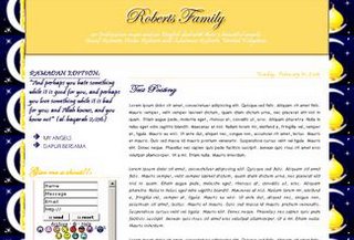 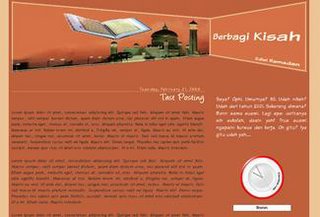
Wednesday, March 08, 2006The Retro Theme
After I finished with the layout for Tominta Family, I was asked to make one for their niece's blog, Dita. It was funny when she told me the theme she wants, coz I was so blank with that theme...at all hehe. So I let her searched the images she wanted to use then I'd dig the idea. Finally, I could bring it up as her 1st 'n recent blog layout...the Pink-Gray Retro. Labels: advance Monday, March 06, 2006Previous Designs for Blumenophi
Finally I could collected the attachments of the layouts I made for Blumenophi. But still I couldn't find the attachments for the 1st one (too bad, I didn't try to collect my works before). 'N these 2 layouts were made before the Flipped Leaf. This one I name it The Maroon Books...since the owner of this blog wanted the blog to tell about her back to school again. 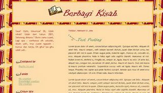 'N this one is The Blue Seashell. Nothing spesific, just the blue color as request from the owner. 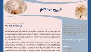 Labels: advance Sunday, March 05, 2006Other Layout of 'My Home'
This is another layout I made for 'my home'. The color of sand I used with the map of Egypt as the background plus the image of pyramid 'n sphinx. It shows clearly about the Pharaoh's land. 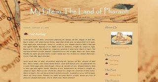 Labels: simple Saturday, March 04, 2006My Project
Beside webdesigning, I also love cooking. This combination of interests inspired me to make a project to fulfill both desires. Then this Dapur Bersama (=Shared Kitchen) created...the kitchen I share with some friends of mine to exchange our recipes. This is the 1st layout I designed for Dapur Bersama. I named it The Colorful Kitchen, since the idea came inside my mind at that to show a cheerful kitchen. 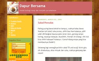 The next layout I made for this kitchen was The Maroon Kitchen. Love the color so much...very elegant from my point of view. 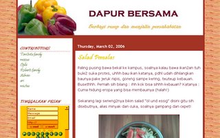 Then...this one is coming. The recent layout for Dapur Bersama...The Kitchen Window. After too long the kitchen was abondened. This layout looks so classic. I always dream to have a kitchen with a big window facing the yard. 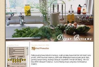 (view) (view)Friday, March 03, 2006The Roberts
The title I give to this design is The Lily. The 1st layout I made for Roberts Family who was at that time living in England. I like the capture of the single lily at the header...looks georgeous in the combination with golden color of the title 'n border. 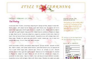 'N this one I made for the blog of The Kids of Roberts Family. My 1st layout design for kid's blog. 
Wednesday, March 01, 2006Other Designs for My Own
For the month of Ramadhan last year, I made a design for my blog...a blue Ramadhan Edition layout. Blue for describing the calm feeling that I always feel ini this holy month.
Labels: simple |
|||